Cartography Examples
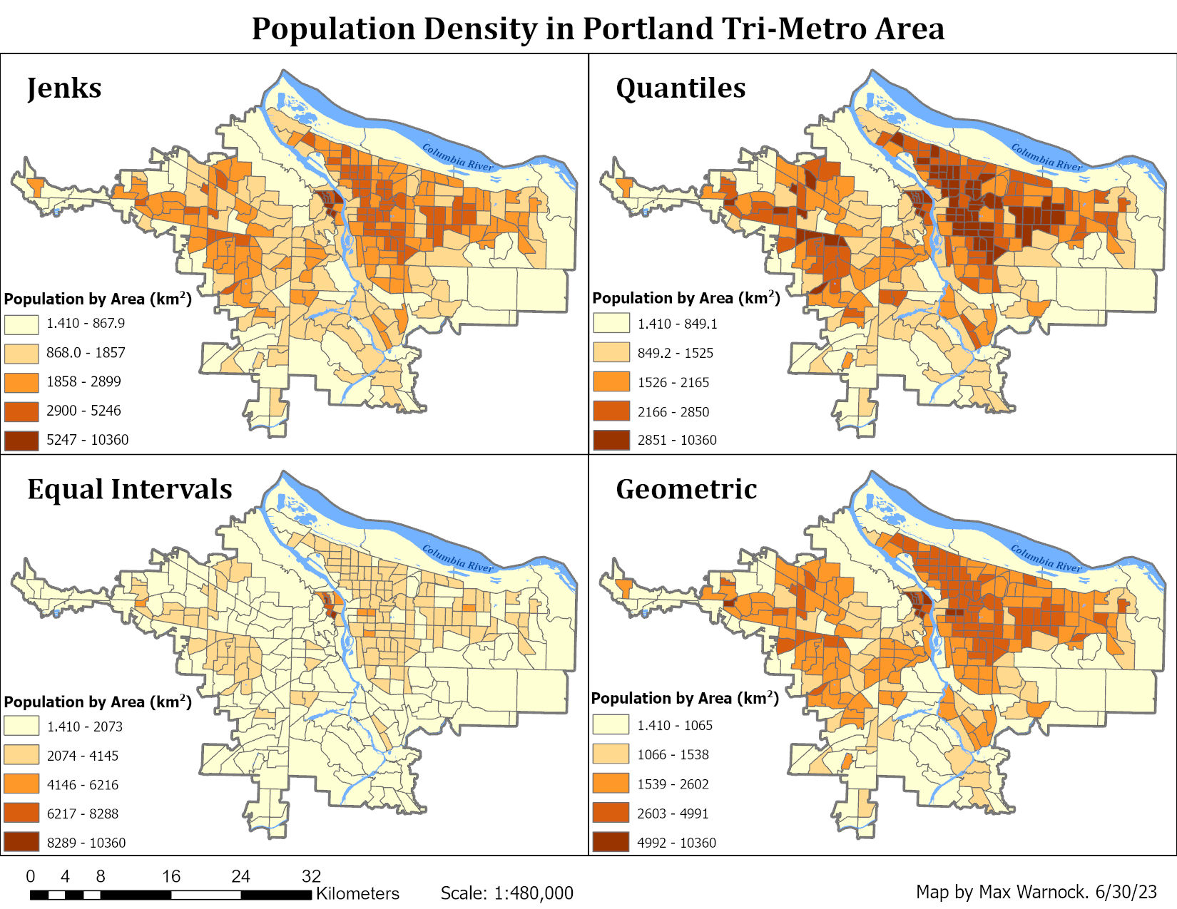 Population density maps of the Portland Tri-Metro area shown with different choropleth classification methods. Certain methods are useful for different data distributions. In this case, the quantile method shows the most difference between zones.
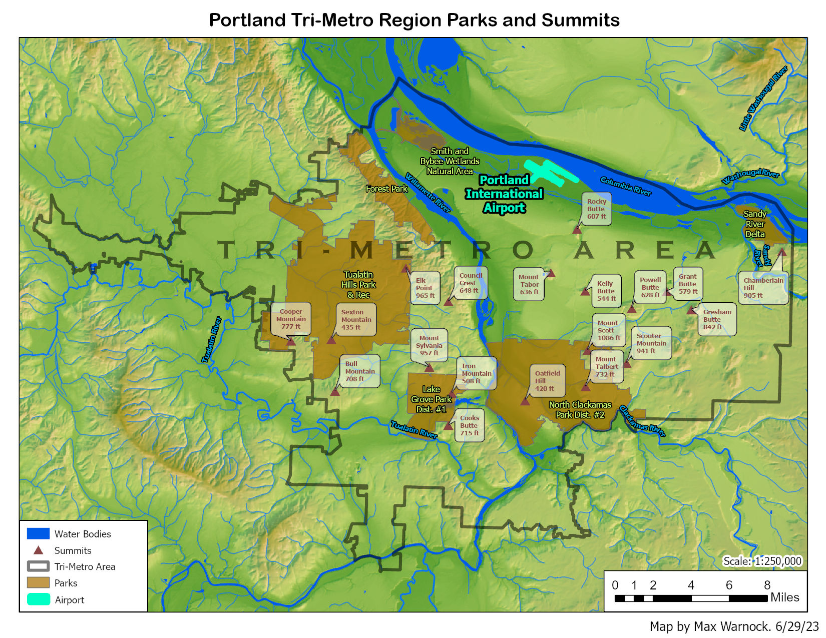 Map of the Portland Tri-Metro area showing the airport, parks, summits, water bodies, general topography, and the boundary of the Tri-Metro area.
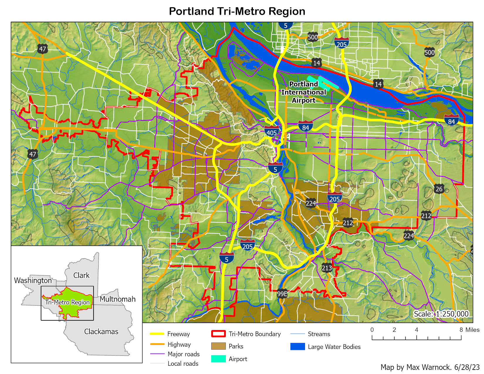 Map of the Portland Tri-Metro area showing roads.
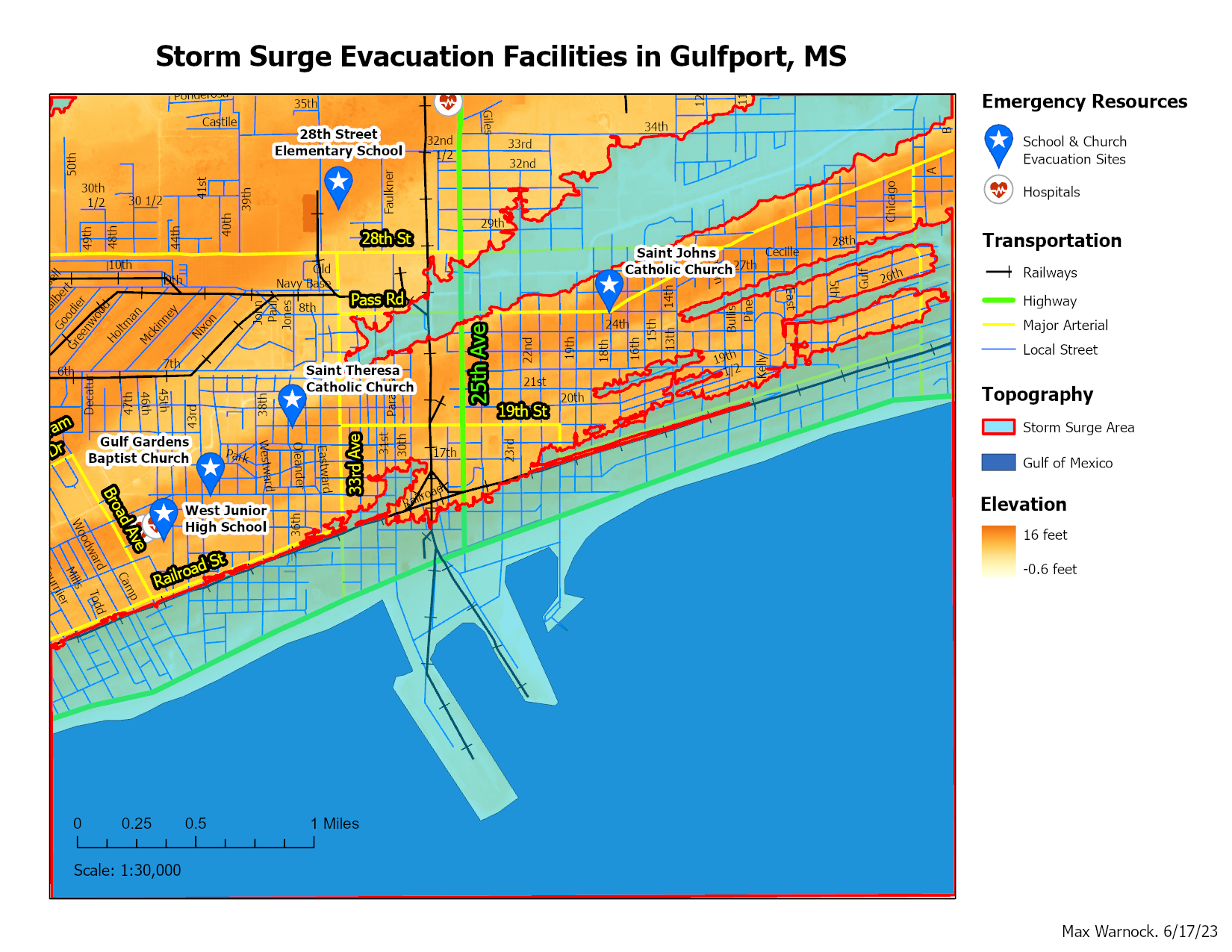 Map of Gulfport, MS, showing storm surge areas based on elevation as well as emergency resources.
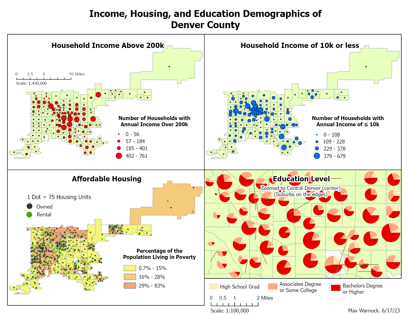 In this figure, the top two maps compare the locations of high income households (>200k), and low income households (<10k) in Denver, CO. The bottom left map shows locations of affordable housing, and the bottom right shows a zoomed in snapshot of education levels within central Denver. Data for these maps was taken from the U.S. Census and the Denver Regional Council of Governments (DRCOG).
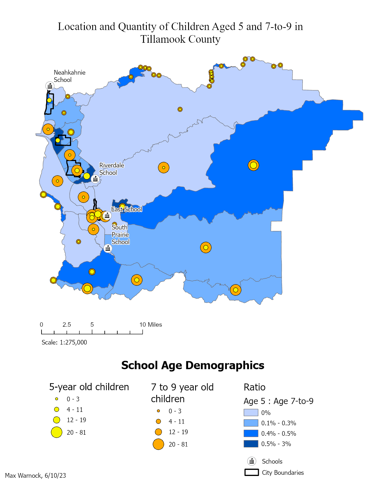 Map showing locations of school-aged children in Tillamook County, OR. This map could be used to help determine locations for new schools.
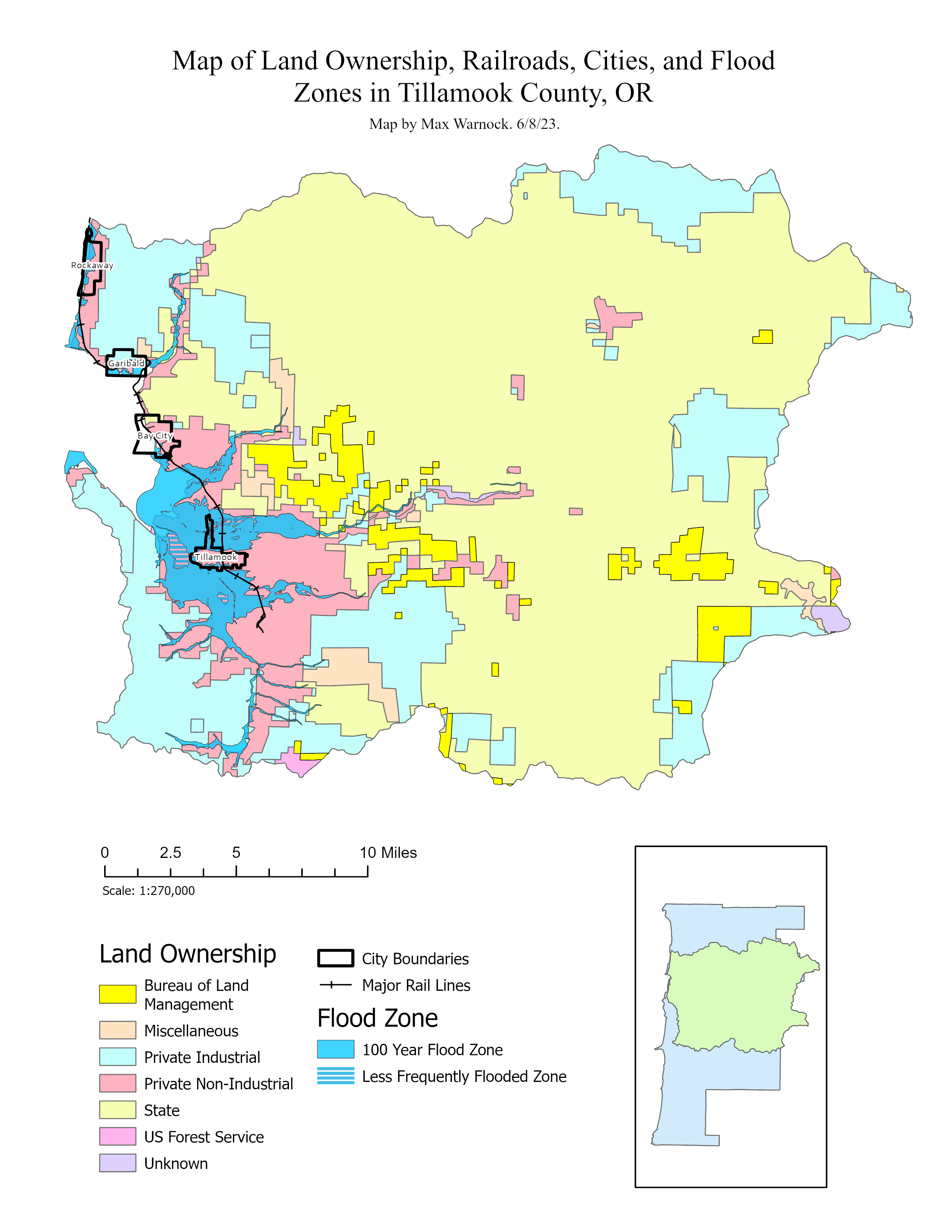 Map showing land ownership, railroads, cities, and flood zones in Tillamook County, OR. This map could be used for general planning purposes.